Using colour theory to define your brand
How to create your signature palette
How to create your signature palette
Colour makes people stop and smile.
From admiring a cherry tree covered in delicate pink blossoms to complimenting a colleague on his sky-blue tie and charcoal suit combo.
Colour grabs attention.
It also evokes our emotions. The colours you choose for your brand don’t need to match your loungeroom décor but they need to inspire the right mood for your audience.
Some people switch their favourite colour like changing their socks (we’re talking to you, Head Ninja Kathleen). The colours they’re drawn to are influenced by their mindset.
Others get a colour crush as a kid and never look back.
So how do you know which colours will attract the audience you want to connect with?
By delving into a little theory (don’t worry, it won’t be hard).
More than your logo, website, packaging or uniforms – a brand encompasses the entire experience a customer has with your business. They use all of their senses to understand who your brand is and decide whether it’s the right fit for them.
It’s not about what you think your business stands for (sorry, but we like to be honest). A customer's perception of your brand is what their buying decision is made from.
How do you change their perception?
By harnessing the visual power of colour.
If we name drop a few big brands, you’ll instantly get an image of their hero colours in your head. Let’s play:
Whether you like those brands or not, their colours are ingrained in your memory.
But how do they do it? By using strong colour contrasts and doing it consistently (like, over and over and over again).
Consistent creative branding unlocks the doors to brand recognition.
P.S. Notice how heaps of big brands use bold blues or reds, and sometimes even both? They’re both eye-catching and high contrast when paired with white. Take note.
Without saying it, your brand colours speak to your audience. Soft greys whisper simplicity and no fuss, bright yellow shouts with energy and enthusiasm.
Knowing what you want to say to your audience makes it easier to know which colours will help you convey your message.
Start by digging into what your brand is all about.
Think about what you do. Spend some time getting clear on the exact solution you provide for your customers.
Next, consider what connections you want to convey. For example, IKEA's brand colours are adapted from the Swedish flag, providing a direct connection to its Swedish lineage.
Some colour combinations have strong associations, like red and green bringing thoughts of Christmas for many people. Blue is synonymous with water and has a calming effect – not a good option for your brand if you’re all about spontaneous action.
Aligning your colours with everything you want your brand to be known for cultivates a positive emotional connection to your brand.
Whether you’re designing custom packaging or planning your website, a little colour goes a loooooooong way.
When customers see your brand and engage with it, how do you want them to feel?
If you want to inspire activity, you might use the liveliness of bright orange. Want to get their imagination firing? Violet will do the trick.
Finding the right combo for your brand involves looking at the colour wheel. It takes careful consideration to avoid ending up with a palette that looks well, just wrong like a unicorn’s vomit.
So let’s learn a little science to make sure your colour combo has your audience gushing not gagging.
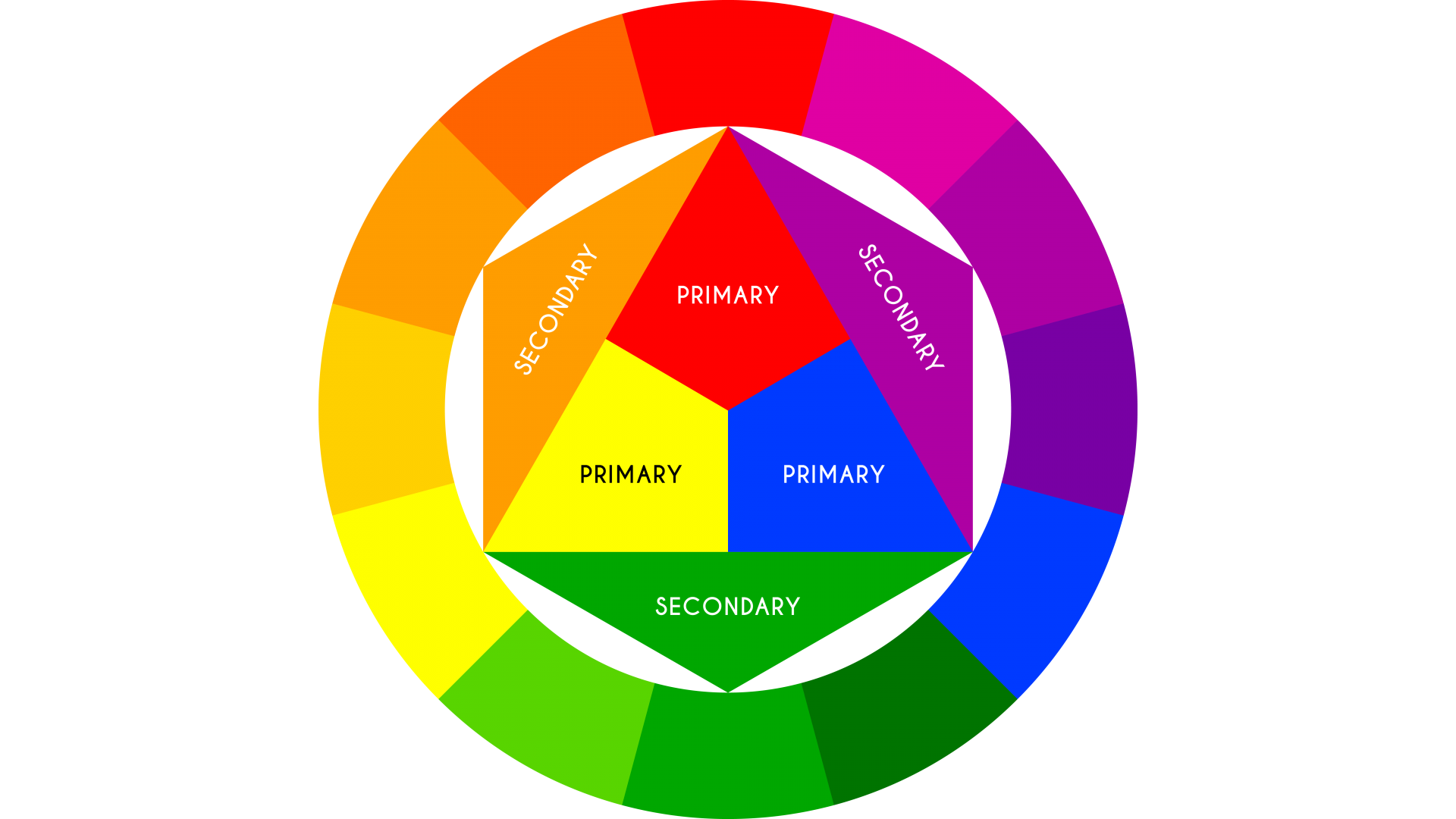
Sir Isaac Newton created the colour wheel in 1666 and it’s still heavily used today. Why? Because it works.
The three colour groups according to Newton are:
Colour schemes have six groups – monochromatic, analogous, complementary, triadic, split-complimentary and tetradic.
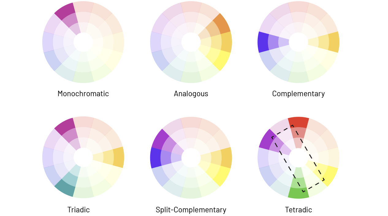
Image credit: https://www.g2.com/articles/color-schemes
Getting the right contrast is best done by choosing from one of the six colour schemes.
Did you know that there are some colours that the human eye can’t see? Trippy, we know.
Consider who will be engaging with your brand, and how accessible your colours are.
Could a person with colour blindness distinguish the colours clearly? If you’re not colour blind, imagining how it looks for a colour blind viewer is not enough. (Especially since there are many types of colour blindness.)
Color Oracle, ColorBlind Web Page Filter and Coblis are all great tools to help you test the accessibility of your colour choices.
It’s not just about making sure people notice the striking designs on your pamphlet.
If the colour contrast isn’t right, they may not be able to read the text. And that’s not just for people with colour blindness. Vision impairment also makes it difficult to read text with low contrast to the background.
Your colours, not your audience.
Cinnamon doughnuts wouldn’t be as tasty if you sprinkled a whole bucket of cinnamon onto them. (Cue sneezes and tongue burn.)
The same goes for certain colours. A pinch here or there and it’s enough to turn heads.
But an entire page covered in it? No thanks.
Some colours are best used sparingly, so it's important to consider exactly how your colour will be used — what platforms and formats.
Fallen head over toes for a particular hue but you’re not sure if it’s the right choice for your brand?
Chat with our brand design experts to find the best fit. Email us at hello@byninja.com.au, call 1800 749 286 or fill in our contact form.