Meanjin | Brisbane, Australia
Transforming complex government reports with engaging designs for better retention.
Location:
Meanjin | Brisbane, Australia
Service area:
Queensland
Sector:
Queensland Government; Department of Education (School Improvement Unit), Department of the Premier and Cabinet, Metropolitan Region, Department of Foreign Affairs and Trade.
Our role:
Publication design; Annual Report Design, Special Report Design, Watercolour Artwork, Infographics.
Government work is frequently ribbed for being the polar opposite of thrilling, dampening the flame of creativity with its often blunt, bureaucratic nature. Our team set out to challenge this stereotype, having been entrusted by various divisions across the Queensland Government to design and deliver a series of reports on their behalf.
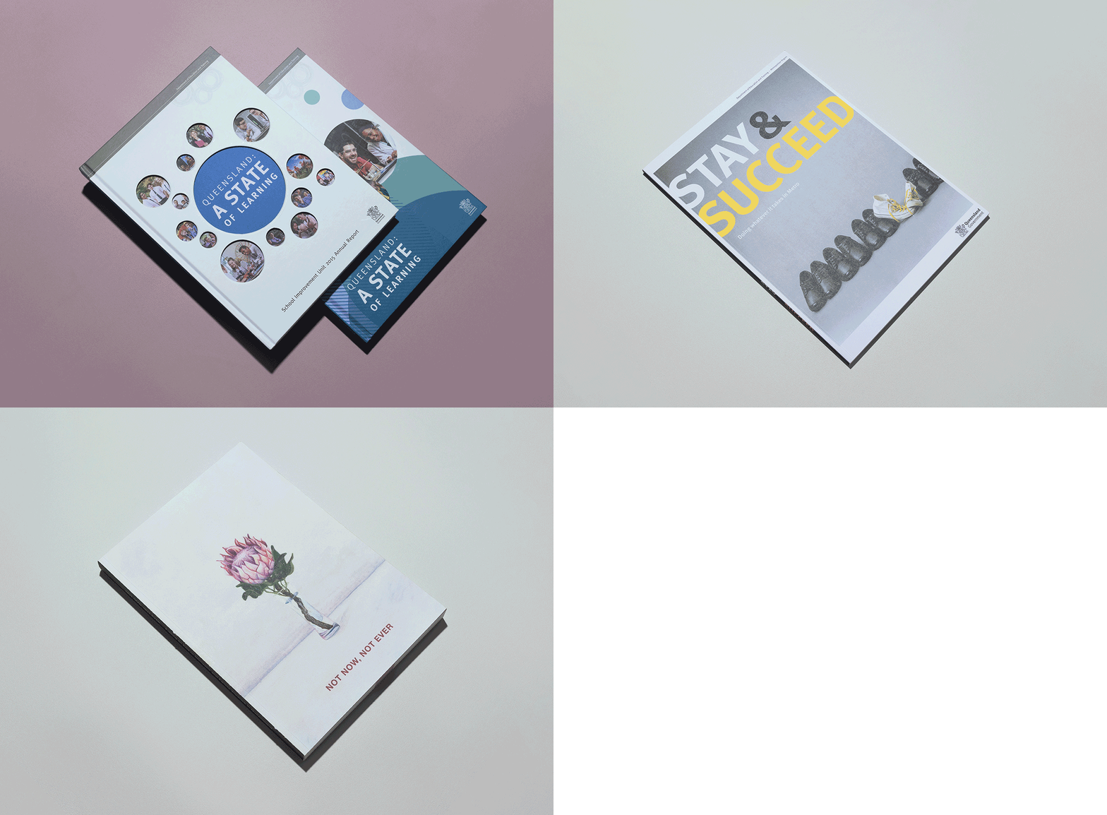
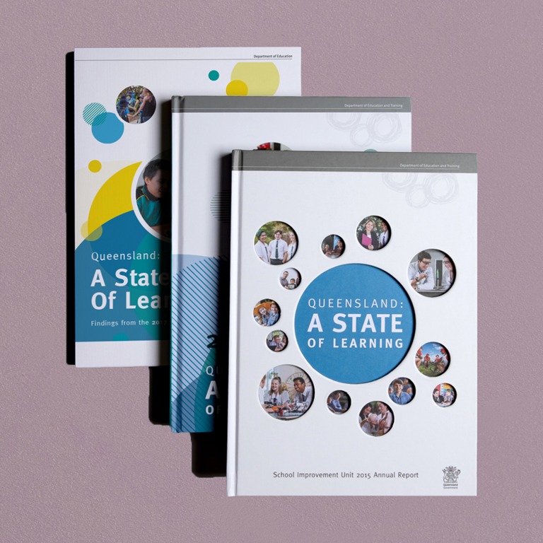
The Department of Education sought our creative expertise in relation to two critical reports. The first was their annual School Improvement Unit (SIU) report, an extensive compilation and evaluation of data encompassing every stage of education, from early childcare to higher education, vocational training, and international education.
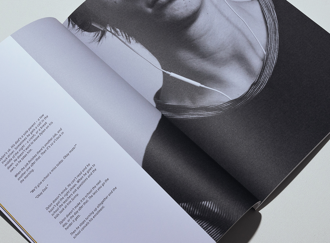
Secondly, we were asked to help design and deliver the special Metropolitan Region Report focused on investigating the many complex reasons behind student disengagement, withdrawal, and ultimately dropping out of school.
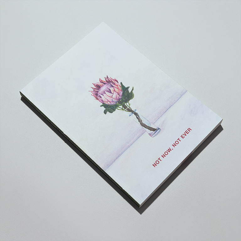
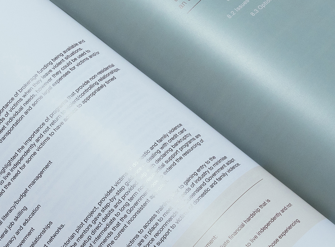
Lastly, our Creative Overlord was called in to use her design prowess to assist in the delivery of the “Not Now, Not Ever” report. This significant undertaking, commissioned by the esteemed Dame Quentin Bryce in collaboration with the Department of the Premier and Cabinet, was aimed to advocate for social and legislative changes to combat domestic violence. The report featured poignant narratives of victims and survivors, as well as the dedicated individuals working tirelessly to put an end to this pervasive issue.
Acknowledging that these reports, with their detailed and intricate nature, often lacked an engaging quality, we were determined to infuse the content with a sense of liveliness and vitality.

In our approach we recognised that due to the vast size and complex nature of government reports, important information can be shelved and lost if it's not carefully curated in a manner that is aesthetically pleasing and clearly highlights the most important take-away facts.
To tackle this, we embraced a collaborative approach throughout the entire process. We worked closely with the respective government bodies to accurately identify and determine the most crucial points to be conveyed. Furthermore, we fostered a strong partnership with printing specialists, engaging in intimate cooperation to bring our shared design visions to life.
Considering the significant differences in subject matter between our Department of Education reports and the "Not Now, Not Ever" report, we remained mindful of our objectives. For the Department of Education reports, our primary focus was on designing in a visually captivating way that facilitated better absorption of the intricate content. For the "Not Now, Not Ever" report, we approached it with a heightened awareness of the sensitivity it required, while still keeping the goal of engaging design in mind.
Ensuring important information is curated, highlighted and presented in a visually appealing, captivating way creates engaging reports that captivate readers.
By collaborating closely with the respective government teams and embracing our curiosity, we were able to generate several carefully curated reports.
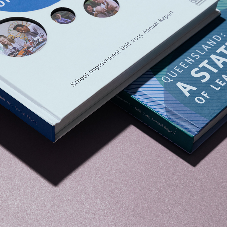
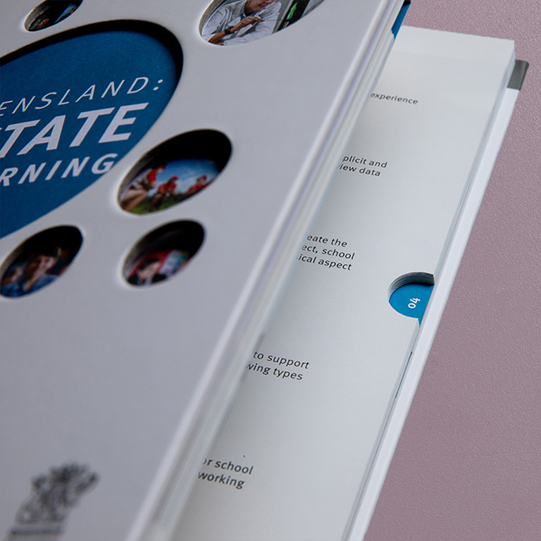
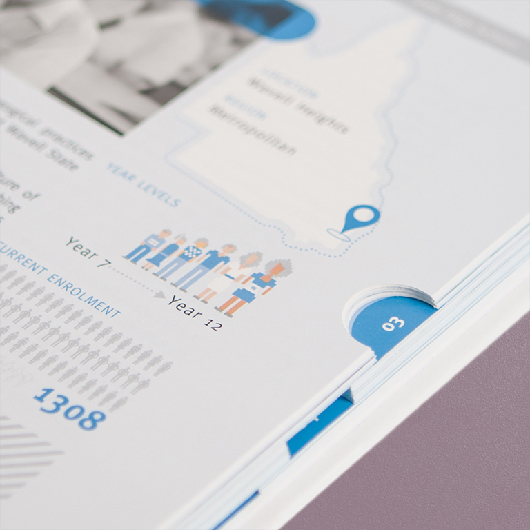
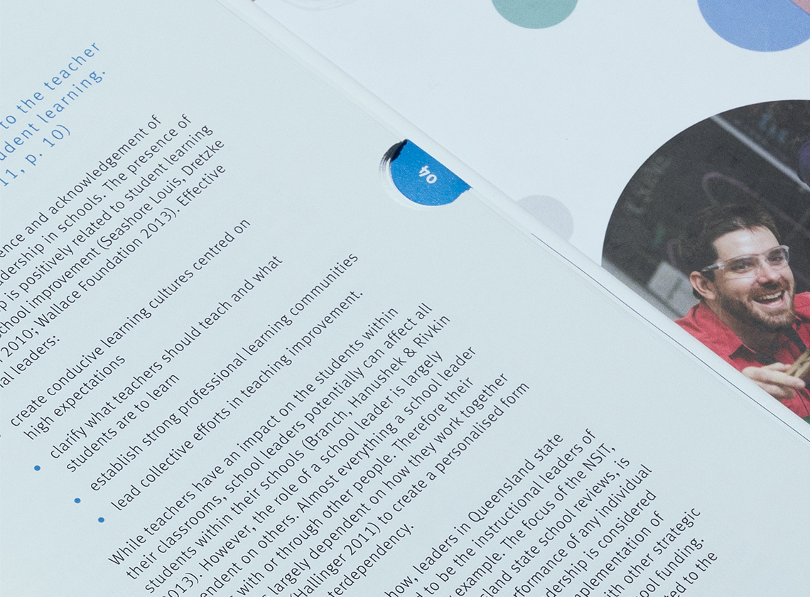
For the Department of Education annual SUI report, we worked closely with printing specialists, skillfully using infographics, clever cutouts, thumb tabs and a handsome hardcover to help the SIU turn a not-so-exciting report into one that was a clear, user-friendly, engaging and interactive printed masterpiece. We also helped broaden the accessibility of the report to high profile persons by introducing a video brochure platform version.
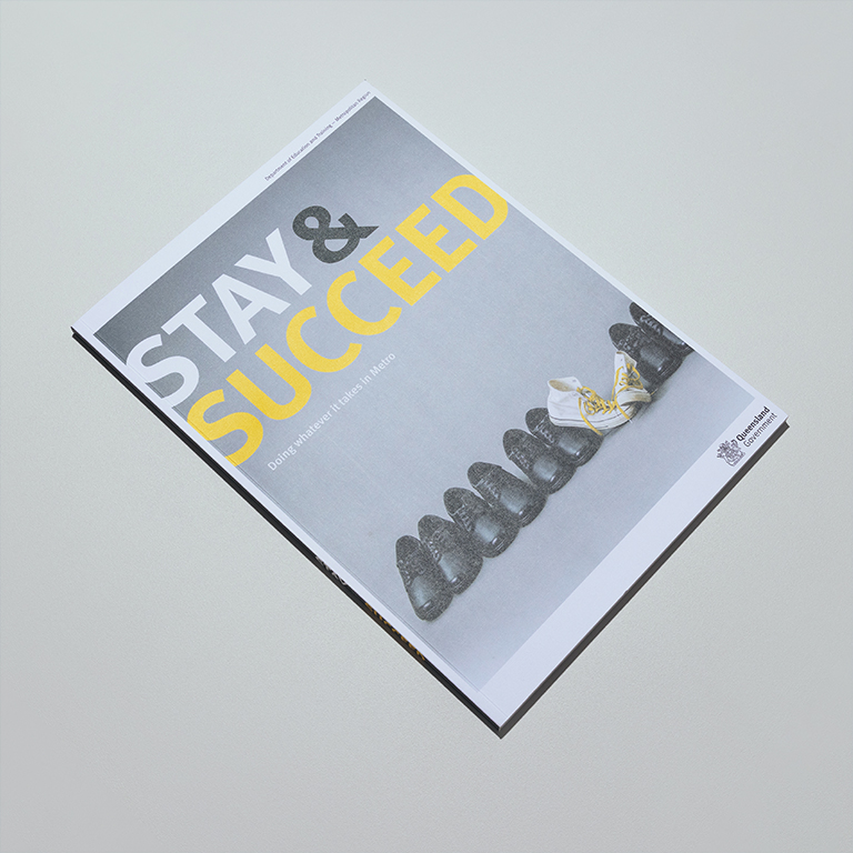
Additionally, for the Metropolitan Region Report we cleverly utilised visual metaphors, subtle textures in the stock and an emotion evoking pallet, allowing us to create a report that conveyed and highlighted the important messages. We were also a bit cheeky and took the Department of Education literally when they said they wanted a report that “can’t just be shelved”, designing it just a smidge too big to fit upright in your standard size bookshelf.
Finally, to symbolise the sensitivity of the “Not Now, Not Ever” report, our Creative Overlord used her own original and tenderly hand painted watercolours, as well as subtle textures in the canvas-like stock cover and a colour pallet that evoked subtle emotions of compassion, belief and hope.
We meticulously crafted each of these reports with a clear objective in mind: to enhance engagement and facilitate better absorption of the content. The outcome has been resoundingly successful in each case.
The Department of Education provided valuable feedback on the SIU report, acknowledging a noteworthy surge in readership and expressing positive sentiments towards it.
They provided similarly positive feedback on the Metropolitan Region Report. They highlighted the significant impact it had on effectively raising awareness about the difficulties faced by these at-risk children. As a result, it played a critical role in garnering political support for extended trials in school.
Last, but certainly not least, the groundbreaking "Not Now, Not Ever" report garnered national recognition and played a pivotal role in instigating parliamentary changes at the state level. This development is particularly thrilling and exemplifies the report's profound influence.
Overall, these reports have demonstrated remarkable success in achieving their intended goals, leaving a lasting impact on readers and influencing positive change.

Doing things differently starts with a conversation.